Designing for user’s behavior
We found out that both traffic and sales from native app was more than 90% and traffic on web solution on mobile device (for casino games) was more than 90%.
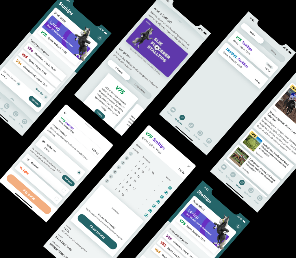
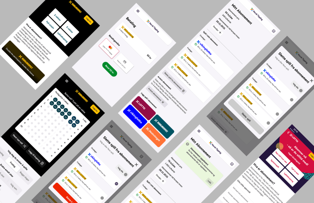
But the casino games could not be added inside the native platform because of technical limitations, so whenever a customer wants to play casino games via native app, we had to redirect them to the web-solution on the mobile browser.
But there was one problem,
Since the native app uses its native patterns, the users experienced un-uniform navigation pattern on mobile web-version coming from the native app. Because web-version in mobile used different design pattern (compared to native) which was an expandable overlay.
In addition, the overlay was hindering scrolling (after observing hotjar recording of actual user sessions), since recently we had replaced the horizontal scroll pattern with vertical scroll pattern.
Therefore, we decided to design and test a similar design pattern that native solution had and created a modal drawer navigation on casino games instead of using expandable overlay pattern. We tested out this with users and was well received by users with some feedback on usability.
Key take away here is, insight is key to make decisions on improving user-experience and user-experience these days does not only confine with one platform, because touch-points are spread out across different platforms. Creating a similar experience across platforms helps user to reduce cognitive load on learning new patterns and user feel they are in the same ecosystem which build their trust on the brand and product.
We know one company did that very well, Apple.


